Primal Cravings: A Collection of Anal Erotica by Jolynn Raymond
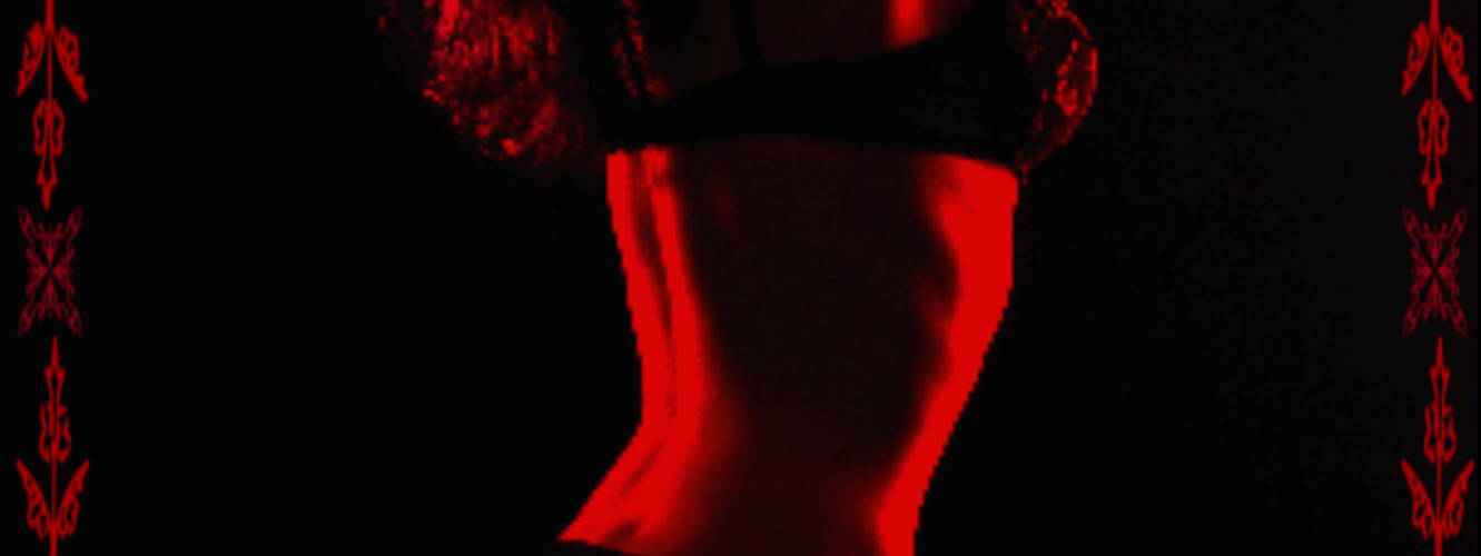
I have a new book, Primal Cravings, due out this summer that is a collection of anal sex erotica. I have played around with various covers and have come up with the two here as my favorites. I’d like my readers opinions. I have never had covers that were in your face sex, and wish to keep it that way but part of me likes the red better than the blue because red brings to mind heat, and this book will be very hot. We’re talking anal sex here and well that brings to mind something that is nasty, steamy, and dirty all rolled up into yum.
Do you think her ass is well enough covered for Amazon?
Do you think the red is better?
Is the cover too dark for a thumbnail?
Which one says yes, yes, I feel primal cravings, give me my anal sex stories?
Please scroll down and tell me your thoughts in the comment box.


Thank you all for your input, it’s best to know how readers react to things. Cara I looked up anal in the book category and there are a few. I think it may or may not fly. With Amazon it depends on the day. I’ll scrap the blue one and work on the red. I did make another that was lighter and brighter but it loses the effect of being a photo. Grr… just have to keep trying.
Red is always better than blue with erotica. However, I think the cover is too dark too indistinct. Nor does thegold lettering of the title and your name stand out–there is not enough contrast. I like “Primal Cravings” as a title, but I wonder if “anal” will make it past the Amazon censors. I like that it’s in the title–I would recommend keeping it if you can–but I wonder if it is word that will get you banished to the Amazon dungeon where no one will see your book.
I think the red cover is the best! It is very erotic but everything is covered enough for Amazon! Can’t wait for the book!
I definitely like the red cover better! It fits the subject and you style of writing so well! You do make a good point asking about a thumbnail image and I’m afraid the red won’t do as well as the blue in a thumbnail.
Definitely the red and gold cover. It is eye catching and apropos for the content. Looking forward to another book.